.svg)


In this guide, you’ll learn which metrics to track, how to structure a dashboard for different audiences, and how to build a CRM-native dashboard using HubSpot or Salesforce data. You’ll also see how to create a partner-facing experience where each partner automatically sees only their numbers in real time.
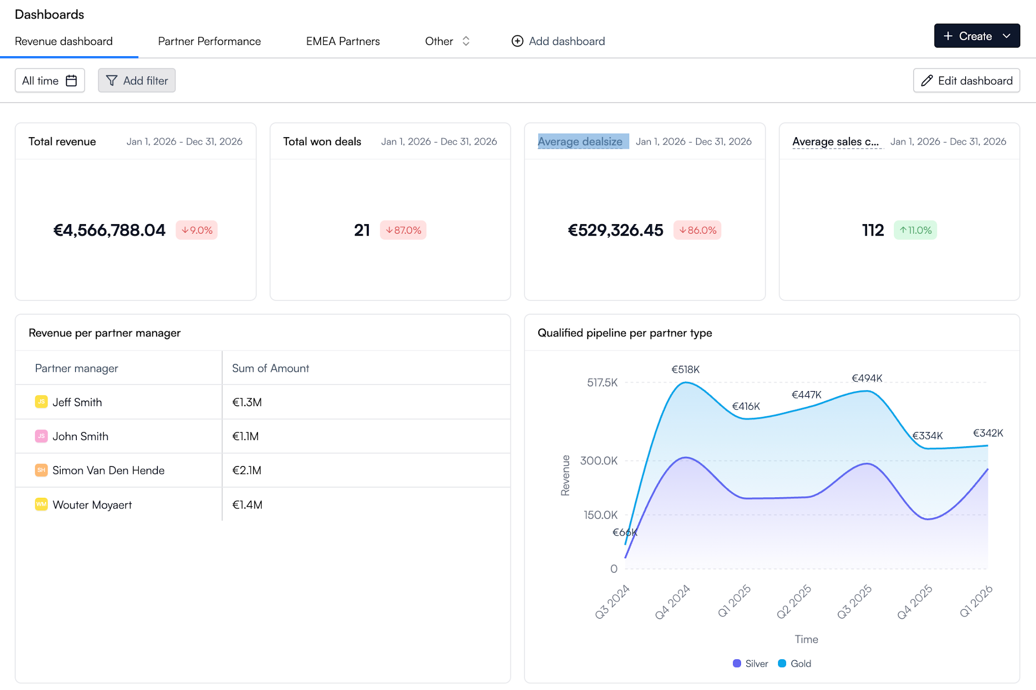
What Is a Partner Dashboard?
A partner dashboard is a visual view of your partner program’s performance. It combines multiple reports into one place so your team can track revenue, pipeline, partner activity, training progress, and ROI.
Think of it this way: a report answers one question, while a dashboard brings together the key metrics needed to understand the health of your partner ecosystem.
.png)
The best partner dashboard serves two audiences:
- Leadership teams need partner performance analytics, performance data, and real-time insights to make informed decisions about revenue, growth, and ROI.
- Partners need visibility into their pipeline, goals, earnings, and partner tier so they can identify opportunities and improve performance.
This is where many partner programs struggle. A dashboard built only for executives often lacks the detail partners need. A dashboard built only for partners rarely gives leadership the actionable insights required for strategy and forecasting.
That’s why leading teams use a dedicated partner performance dashboard for leadership while also giving partners access to their numbers through a partner-facing view. Combined with strong partner relationship management and partner analytics, dashboards become a single source of truth for the entire program.
But to work well, those views need to serve the right audience from the start.
Why most partner dashboards fail
Most partner dashboards fail for one of three reasons.
They live outside the CRM
When dashboards rely on spreadsheets, exports, or separate tools, the data is already outdated.
Partner activity, revenue, and performance data belong in the CRM. Building on top of a HubSpot integration or Salesforce integration creates a single source of truth with real-time reporting and real-time insights.
They are built for only one audience
Leadership and partners need different views.
A CRO wants key metrics like revenue, ROI, and which partner tier drives the most value. Partners want sales volume, goals, training progress, and performance data they can use to improve results.
The best partner ecosystem uses separate, customizable dashboards for each audience.
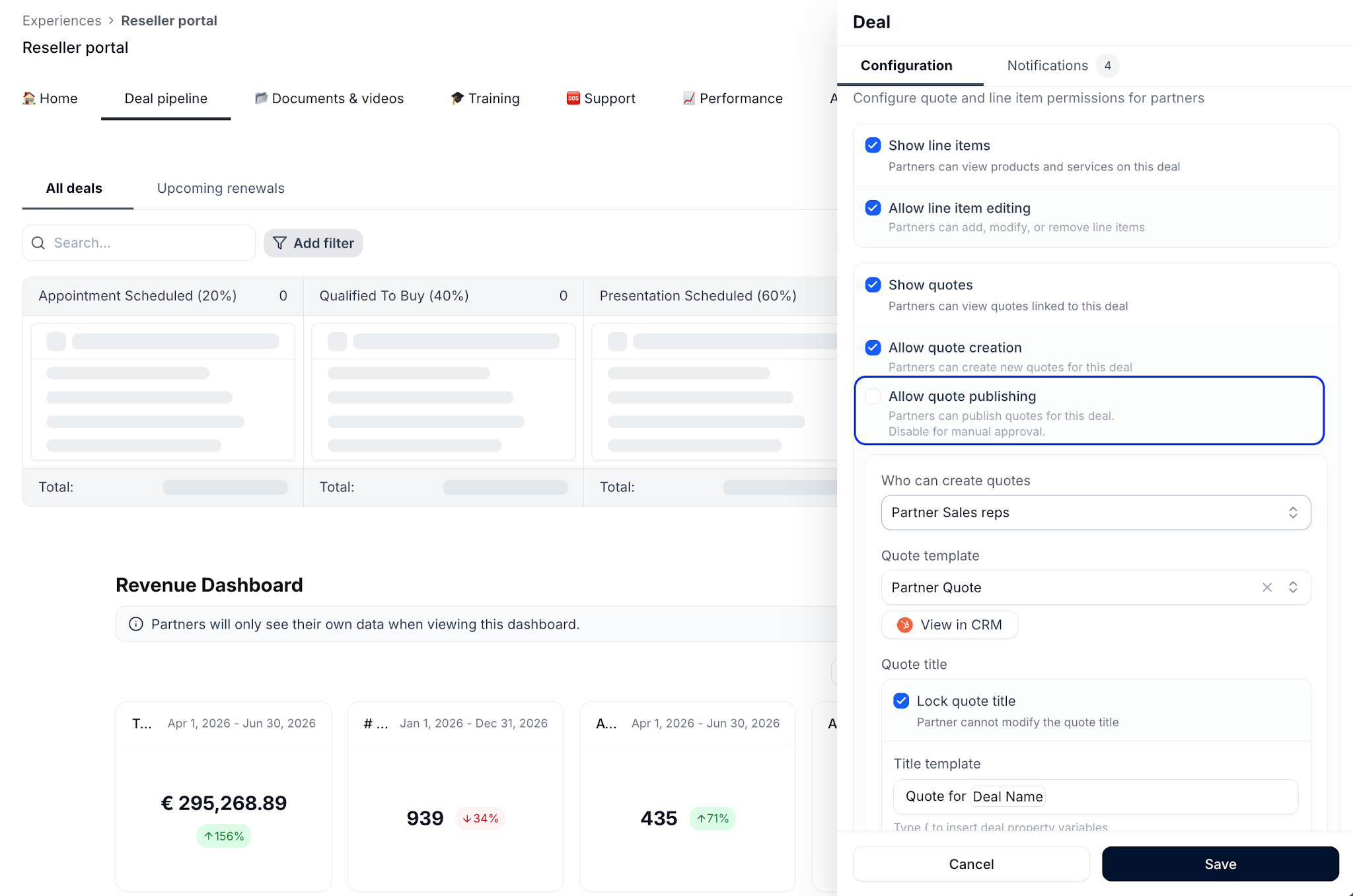
Partners never see them
Many dashboards are internal-only reports.
Without visibility into their performance, incentives, and goals, partners can’t monitor progress or identify opportunities. That reduces engagement and creates misalignment.
The strongest programs embed a partner performance dashboard inside the partner portal, giving partners access to their numbers in real time.
But which metrics belong on each view?
What to include in a partner dashboard (by audience)
The right metrics depend on who is looking at the dashboard.
The CRO / leadership view
This view should answer one question: is the partner program generating revenue and ROI?
Keep it focused on key metrics:
.png)
This role needs actionable insights, not dozens of reports. The entire view should fit on one screen and help leadership make informed decisions with confidence.
The partner manager view
This is the operational view used to monitor the health of the partner ecosystem.
Common metrics include:
- Deals by stage, partner, and partner type
- Deal registration volume and approval rates
- Partner activity and engagement levels
- Onboarding and certification progress
- Partners at risk of becoming inactive
- Progress toward the next partner tier
- Deals stuck past expected close dates
- Sales volume by partner, segment, or region
This view helps teams identify problems early, understand changes in performance, and spot opportunities before they become difficult to fix.
Many teams also use partner relationship management and partner performance analytics data to identify workflow bottlenecks, monitor alignment between sales and channel teams, and support ongoing optimization efforts.
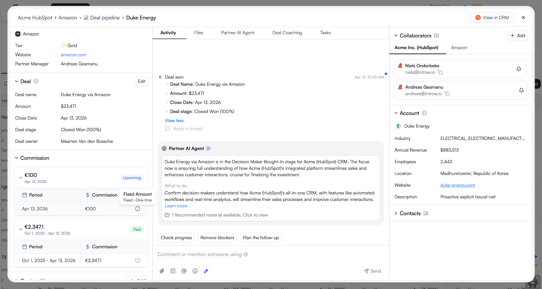
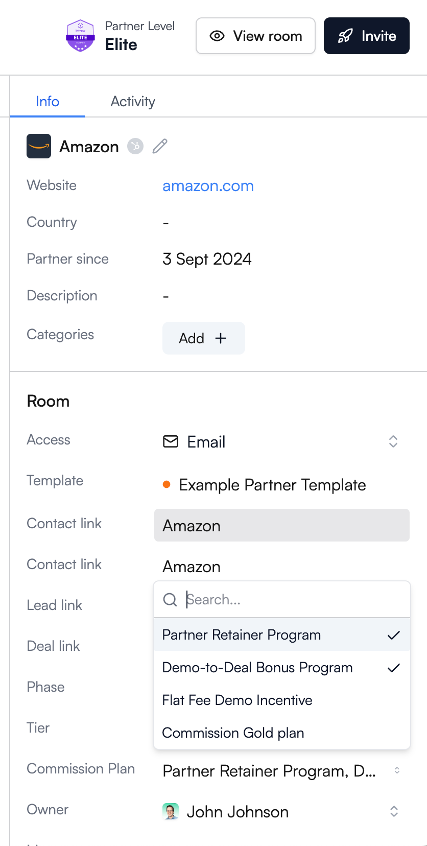
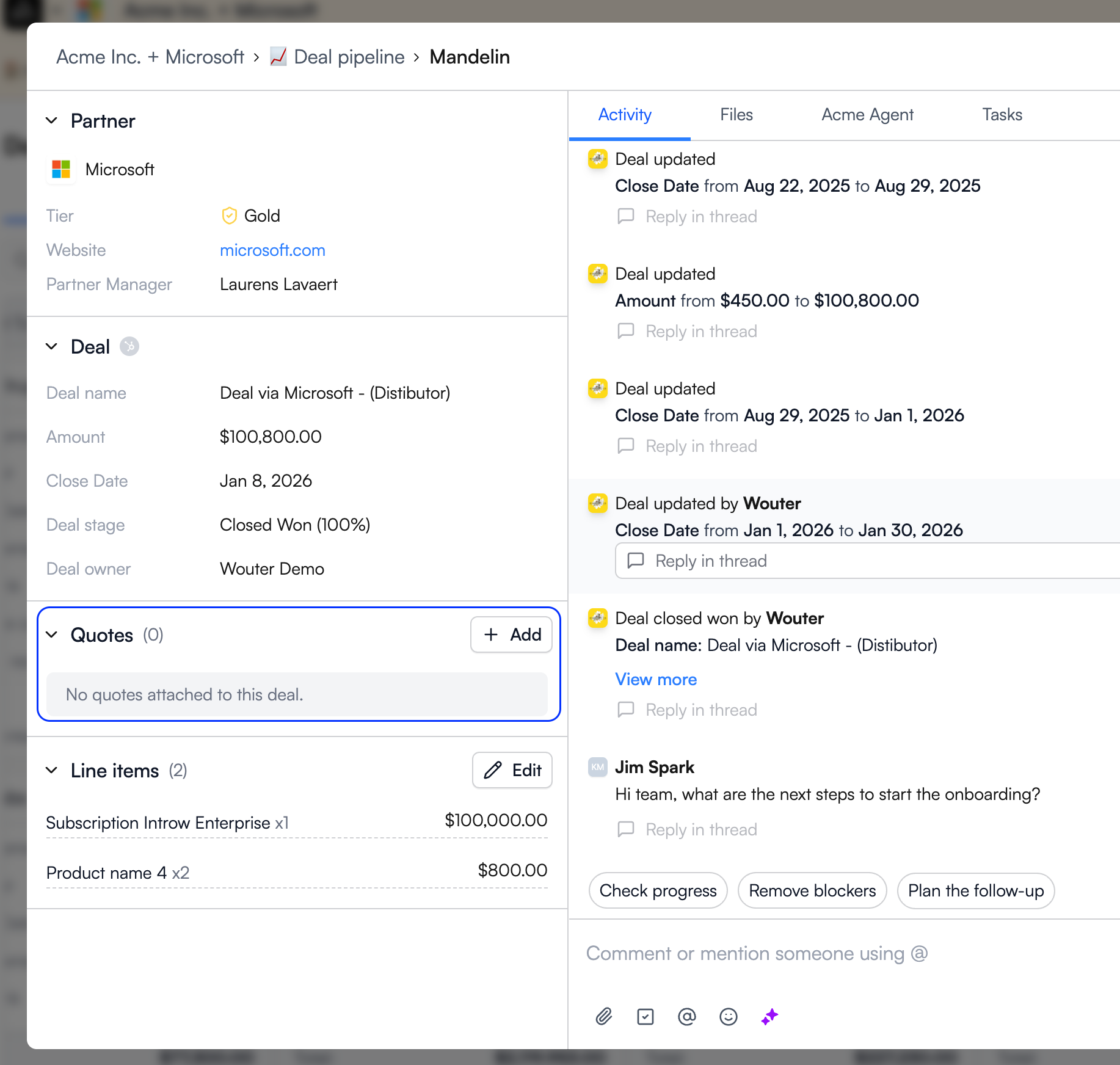
The partner-facing view
This is the view most programs skip.
Partners need access to their own performance data so they can self-manage, track goals, and understand what success looks like.
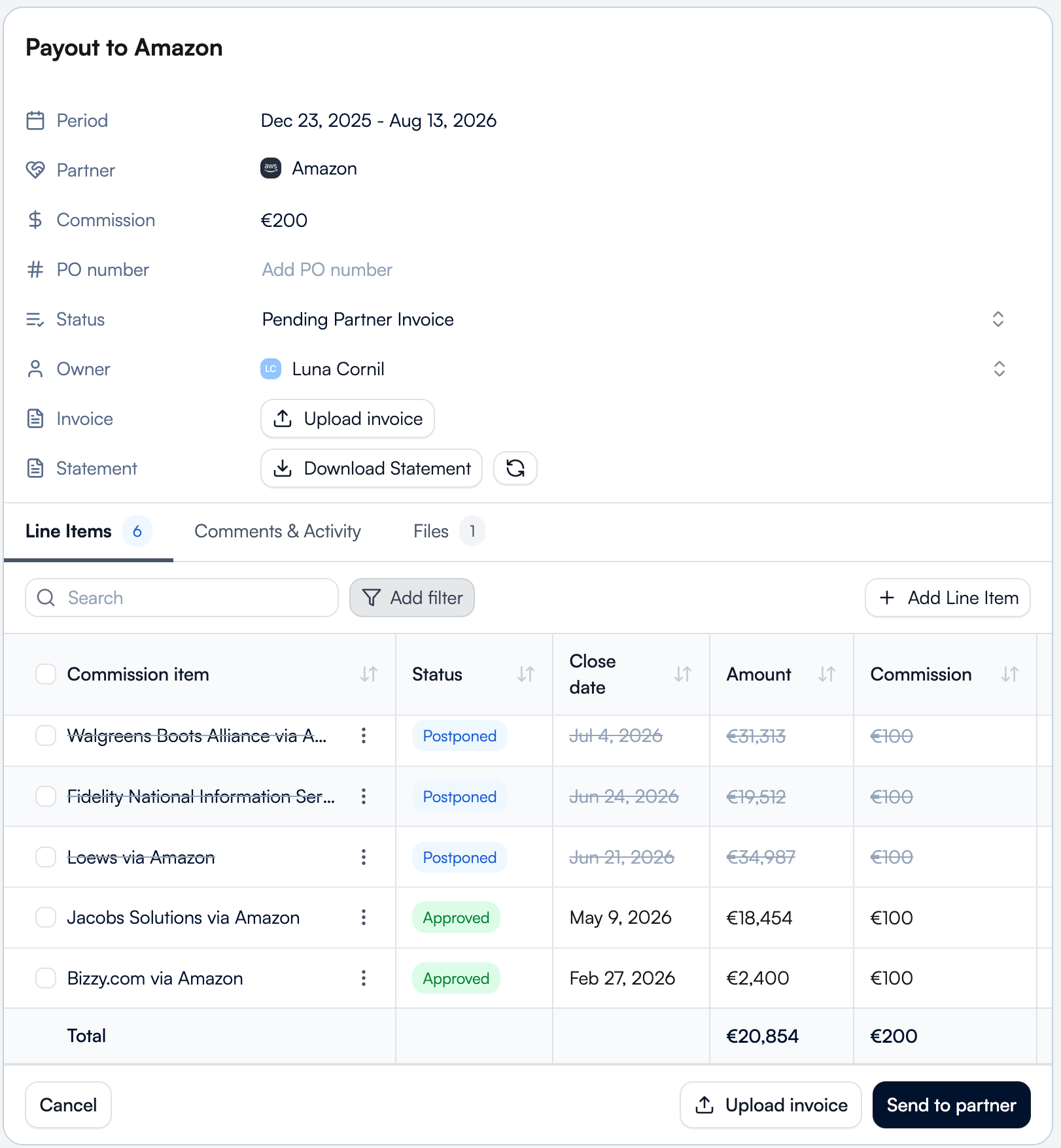
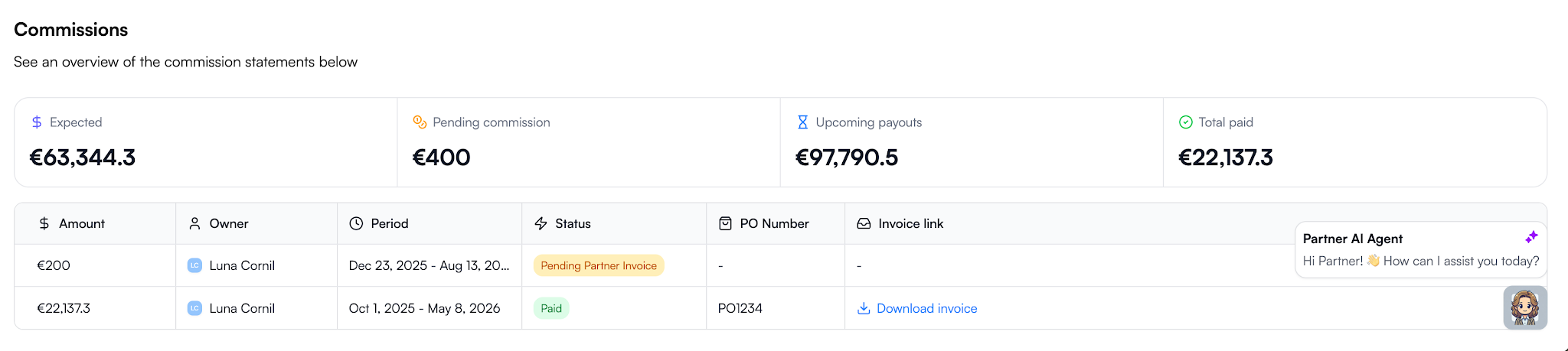
A partner-facing dashboard often includes:
- Sourced revenue
- Influenced revenue
- Open pipeline and deal stages
- Commission and SPIFF earnings
- Onboarding status
- Certification status
- Progress toward the next partner tier
- Performance against benchmarks
When partners can see their own numbers, they stay engaged and take more ownership of their results.
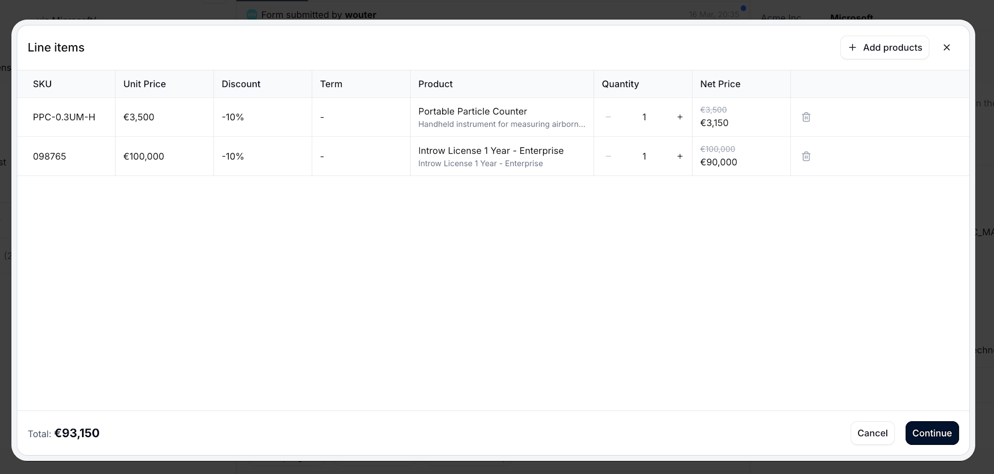
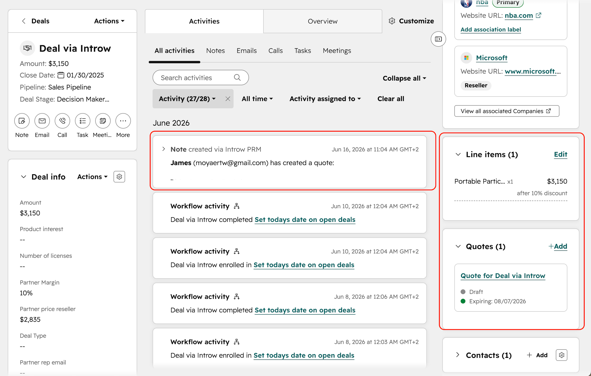
A HubSpot partner dashboard can show each partner’s deals, earnings, pipeline, and activity while automatically hiding everyone else’s data.
Introw's Reports & Dashboards bring that CRM data into one place, giving both your team and your partners a shared view of performance.
But don't be tempted to spam your dashboard with 50 metrics. You just need the right 10 that actually gets used.
The most important partner dashboard metrics
The right metrics depend on your goals, partner type, and program structure. These are the foundation metrics every partner dashboard should track.
A few supporting metrics can add useful context:
- Partner health scores
- Certification completion rates
- Marketing campaign participation
- Portal engagement
- Forecast accuracy
- Activity by region
- Partner-generated pipeline by partner tier
You're not trying to track everything. All you should be doing is monitoring the numbers that help you make decisions, align teams, and improve outcomes across your partner ecosystem.
How to build a partner dashboard
A useful partner dashboard puts the right data in front of the right audience.
.png)
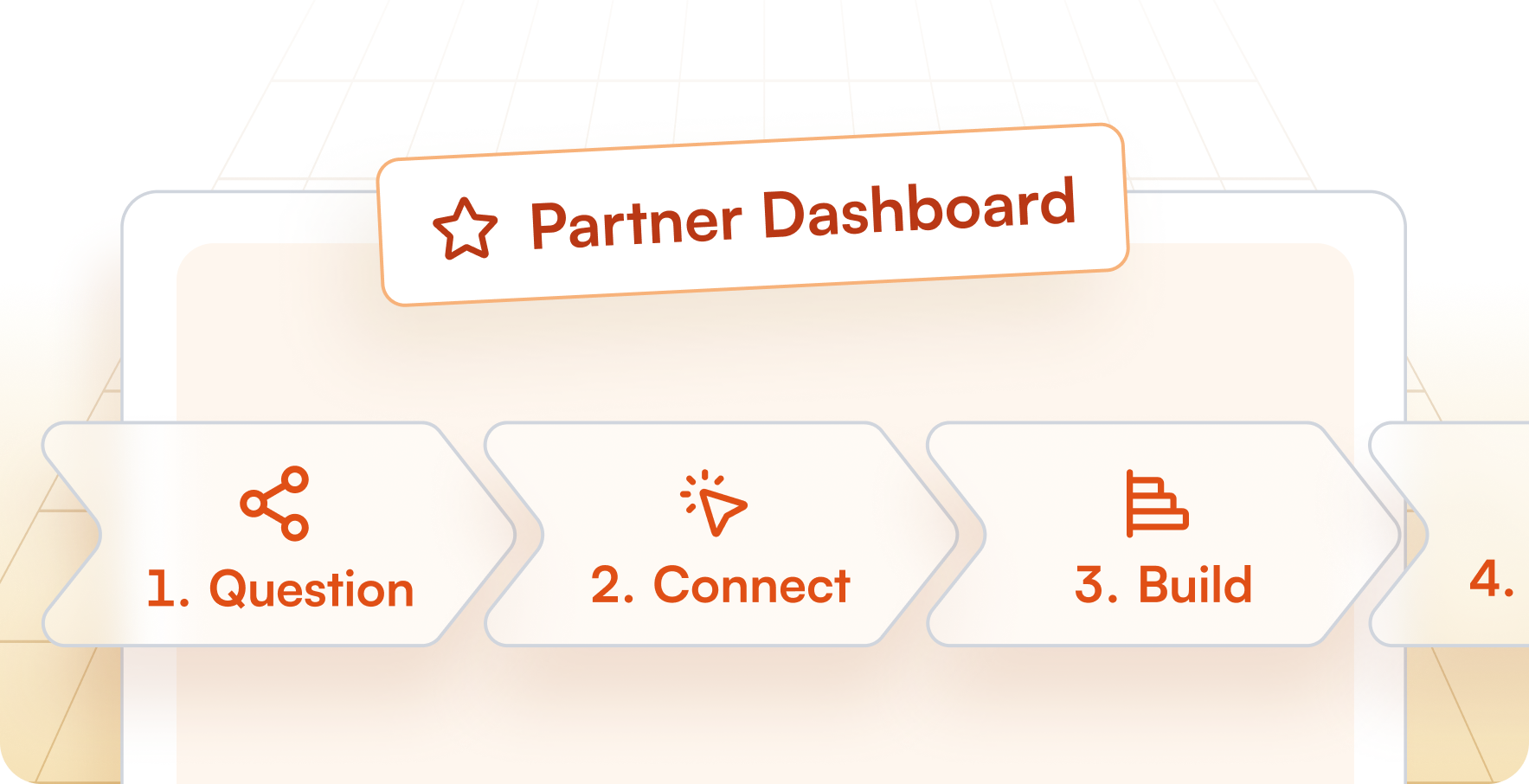
Step 1: Start with the question, not the chart
Decide what the dashboard needs to answer.
- CRO: Is the program delivering ROI?
- Partner manager: Where should I focus?
- Partner: How am I doing?
This keeps you from tracking metrics that don’t drive action.
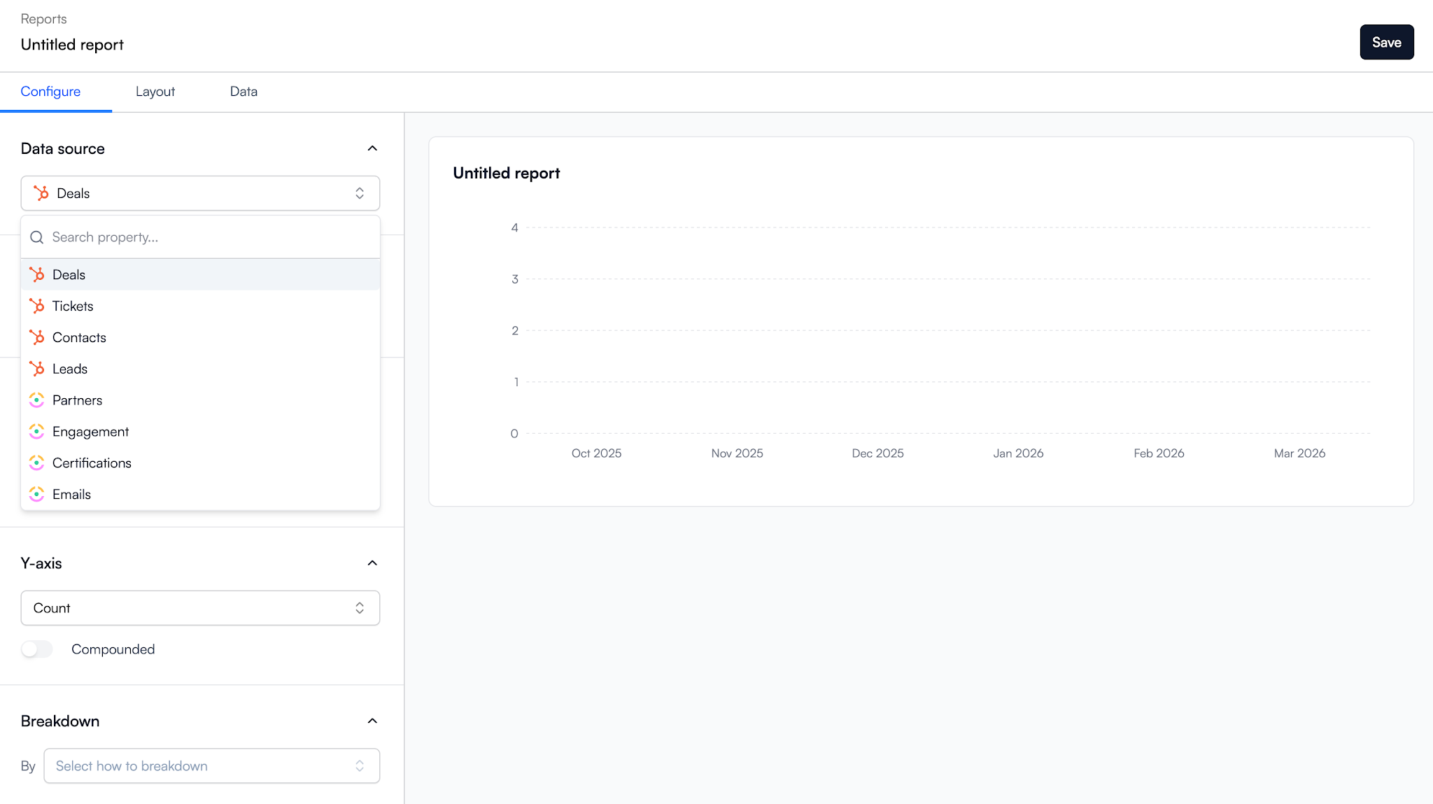
Step 2: Connect to your CRM data
Pull data directly from HubSpot or Salesforce.
When the CRM is your single source of truth, partner activity, pipeline, attribution, and performance stay current. No manual updates. No spreadsheets.
Step 3: Build reports, then combine them into a dashboard
Start by creating reports that answer specific questions.
Examples include:
- Top partners by revenue
- Pipeline by stage
- Deal registrations this quarter
- Partner activity by region
Once those reports exist, combine them into a dashboard view. In Introw, reports are added as widgets to a dashboard canvas, where you can organize them into a layout that matches the audience you’re building for.
Most teams create multiple dashboards rather than squeezing everything into one place. You might have separate dashboards for revenue, engagement, QBRs, or partner tiers. Global date filters make it easy to switch between time periods without rebuilding reports.
Introw’s Reports & Dashboards are built around this workflow.
Step 4: Tailor views by audience
Don’t show everyone the same dashboard.
- CRO: ROI, revenue, growth
- Partner manager: Operations, partner performance, and engagement
- Partner: Pipeline, earnings, goals, and progress
The data stays the same. The presentation changes.
Step 5: Embed the partner view in the portal
This is the step most programs miss.
After building the dashboard, add it to your partner experience. In Introw, reports and dashboards can be embedded directly inside the partner portal. Each partner automatically sees only their own data.
That creates visibility, transparency, and stronger engagement without extra work from your team.
Step 6: Keep it live and review regularly
A dashboard should evolve with your program.
Review the metrics, reports, and filters regularly. Add what helps. Remove what doesn’t.
Because Introw runs on live CRM data, your dashboards stay current automatically.
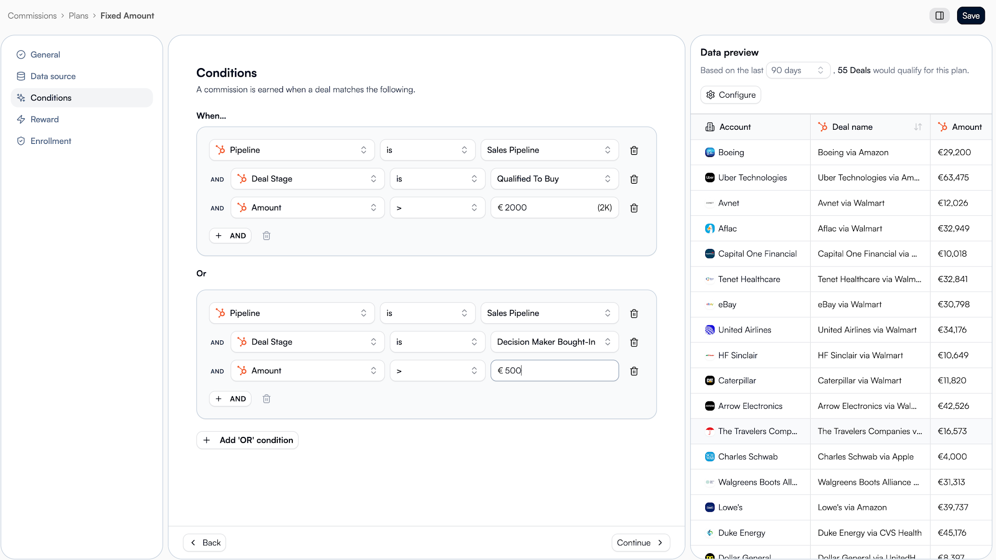
How Introw makes partner dashboards easy
Introw removes the manual work that makes partner dashboards difficult to maintain.
.png)
Built on live CRM data
Many reporting tools rely on exports, spreadsheets, or disconnected systems.
Introw’s Reports & Dashboards run directly on your CRM data. Partner-sourced revenue, pipeline, attribution, and partner activity stay current because the data comes from HubSpot or Salesforce, where your deals already live.
That gives leadership a single source of truth they can trust.
Pre-built partner performance dashboards
You don’t have to start from a blank page.
Introw includes a pre-built partner performance dashboard that tracks key metrics such as sourced revenue, influenced revenue, pipeline, deal registrations, partner activity, engagement, partner tier progress, and ROI.
It also includes filters for different time periods and partner segments, making it easier to monitor performance across your partner ecosystem.
For teams focused on growing indirect revenue, these dashboards provide immediate visibility into what’s working and where to improve.
Custom reports and dashboards
Every partner program is different.
Introw lets you create reports around the metrics, workflows, and goals that matter to your business, then combine those reports into customizable dashboards.
You can create separate dashboards for different use cases, partner tiers, regions, or teams. Global filters make it easy to analyze different timeframes without rebuilding reports.
That flexibility helps organizations answer new questions as their partner strategy evolves.
If you’re building a more mature partner motion, the principles behind strong partner sales reporting become much easier to apply when all your data lives in one place.
Embedded in the partner portal
Most dashboard platforms stop at internal reporting.
Introw lets you embed reports and dashboards directly into the partner portal. Partners automatically see only their own data, performance, earnings, pipeline, and progress. No manual filtering is required.
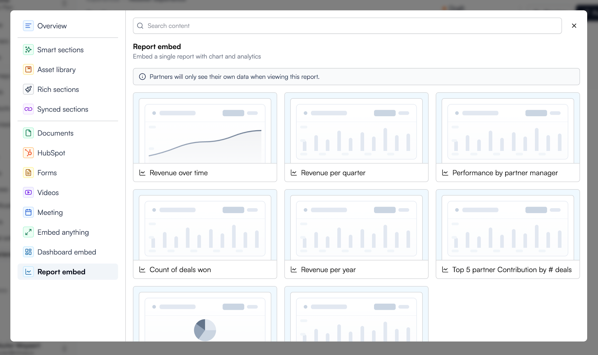
You can review the full setup process in the guides for creating a dashboard and embedding a report or dashboard in your partner portal.
This creates transparency, helps partners identify opportunities, and gives them access to the information they need to stay engaged.
AI-powered insights
As partner ecosystems grow, manually analyzing reports becomes harder.
Introw’s AI Agent helps teams understand trends, surface insights, and identify opportunities faster. Instead of digging through dozens of reports, teams can focus on making decisions and improving outcomes.
For large programs, that can save significant time while improving visibility across the entire ecosystem.
Your CRO shouldn’t need three spreadsheets to understand partner performance. And your partners shouldn’t have to ask for updates.
Book a demo to see how Introw turns live CRM data into dashboards that both sides actually use.
What is a partner dashboard?
A partner dashboard is a centralized view of your partner program data. It combines reports, metrics, and performance insights into one place so leadership, partner managers, and partners can track results without switching between multiple tools.
What should a partner dashboard include?
Most partner dashboards should include partner-sourced revenue, partner-influenced revenue, pipeline, deal registrations, partner activity, engagement, goals, and ROI. The exact metrics depend on your use case and the audience viewing the dashboard.
How is a partner dashboard different from partner relationship management software?
A partner dashboard shows performance data and insights. Partner relationship management software helps you manage onboarding, communications, deal registrations, workflows, resources, and partner engagement. The dashboard is one part of a broader partner relationship management strategy.
What is a partner performance dashboard?
A partner performance dashboard focuses on measuring partner results. Common metrics include revenue contribution, sales volume, pipeline, deal registrations, partner tier progress, onboarding status, and engagement levels.
Why is CRM integration important for partner dashboards?
Without CRM integration, dashboards often rely on spreadsheets and manual updates. Connecting your dashboard directly to HubSpot or Salesforce creates a single source of truth and makes it easier to track changes, monitor performance, and make informed decisions.


.png)
.png)
.png)
.png)
.png)
.png)
.png)
.png)
.png)
.png)
.png)
.png)
.png)
.png)
.png)
.png)
.png)
.png)
.png)
.png)
.png)
.png)
.png)
.png)
.png)
.png)
.png)
.png)
.png)